Surround Insurance Member’s Portal
Project Overview
Timeline: 2019 – ongoing
Tools: Adobe XD, Photoshop, Illustrator
Platform: In house developers
Deliverables: Full mockups, user experience research, interactive prototype
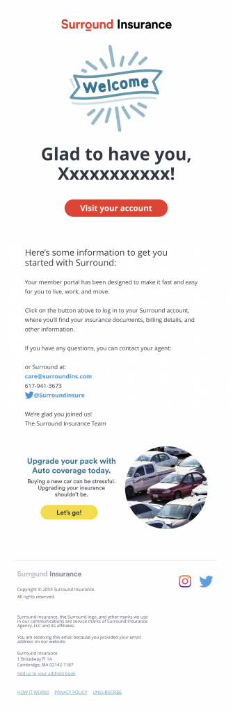
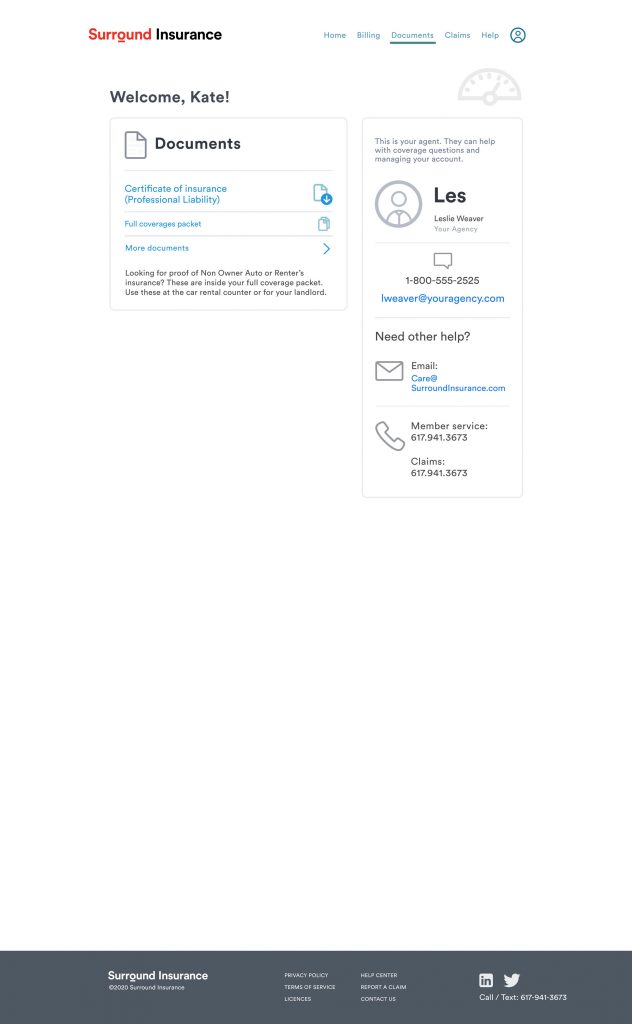
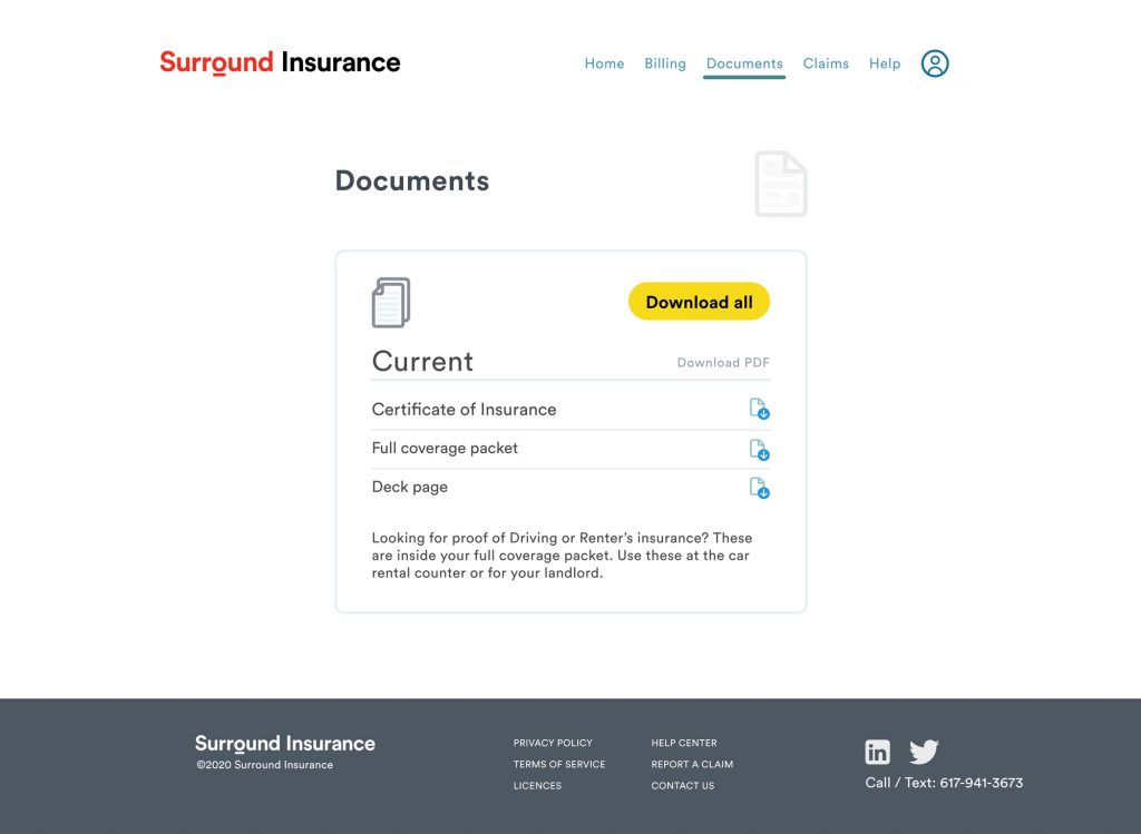
My role: The member portal of most insurance sites is an under-utilized resource. Many members look once to twice a year, typically to answer coverage questions or find documents to prove they have insurance (ID cards and deck page).
Use video to see a click through of the pages.
Discover
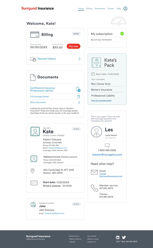
Problem statement: Members need a portal that is easy to use. This means they need to be able to find the information they’re looking in a short amount of time without calling customer service.
Solution statement: Design the member portal with a shallow level of complexity where most of what members need can be found on the home page.
Research
Methods: Since we were creating an insurance product from scratch and we didn’t have existing customer, we tested designs on Usability Hub and watched user interactions on Hotjar.
Research insights: Members only really use their member portal when trying to cancel Surround because they’ve bought a house or vehicle. Custom service calls to get ID cards, or ask questions about their coverage are still zero across the life of the platform.
Not per month. Not per year. Not looking at a small segment. No member has ever called. The platform solves all their needs.
Define
User persona: Jessica was developed to help center marketing efforts. She’s 28, lives with a roommate, doesn’t drive but has a license. She likes biking when she can, talks with her parents when making financial decisions, and hopes to save up to buy a home someday. She is a digital native, but doesn’t check in with her financial products very often.
Competitive Analysis: As long as the member portal isn’t overly difficult to use, members will not use this in their assessment of Surround as a good product.

Scope and Constraints
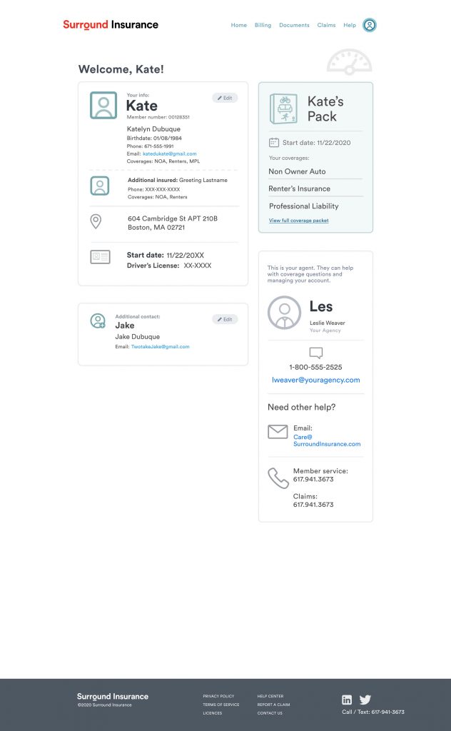
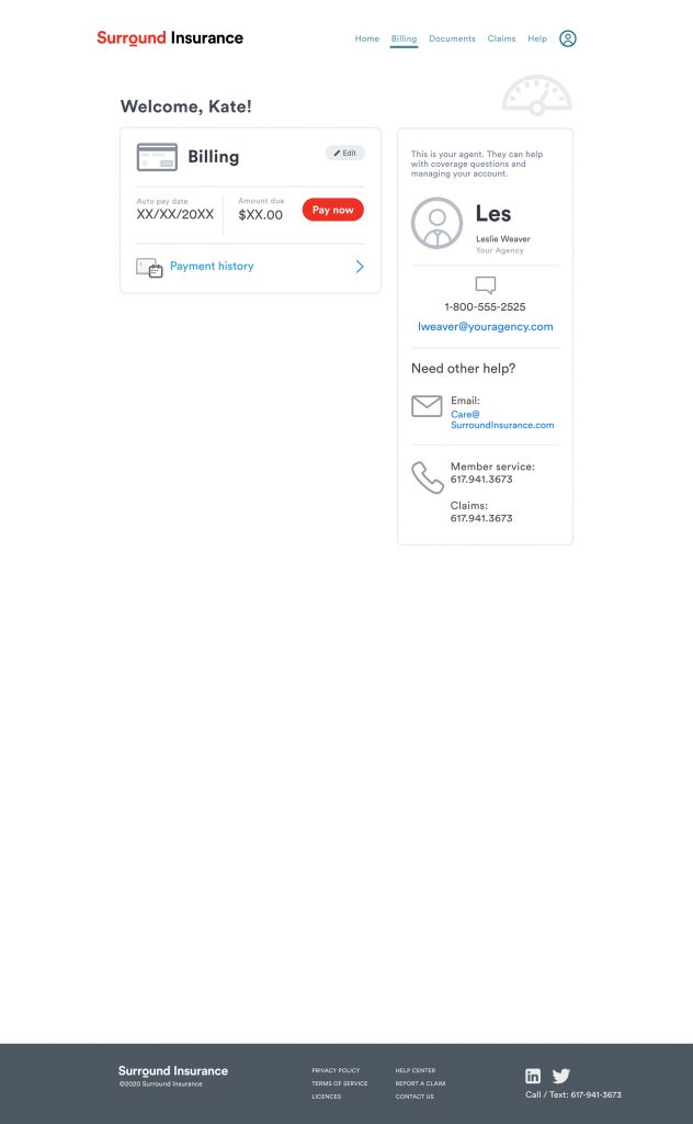
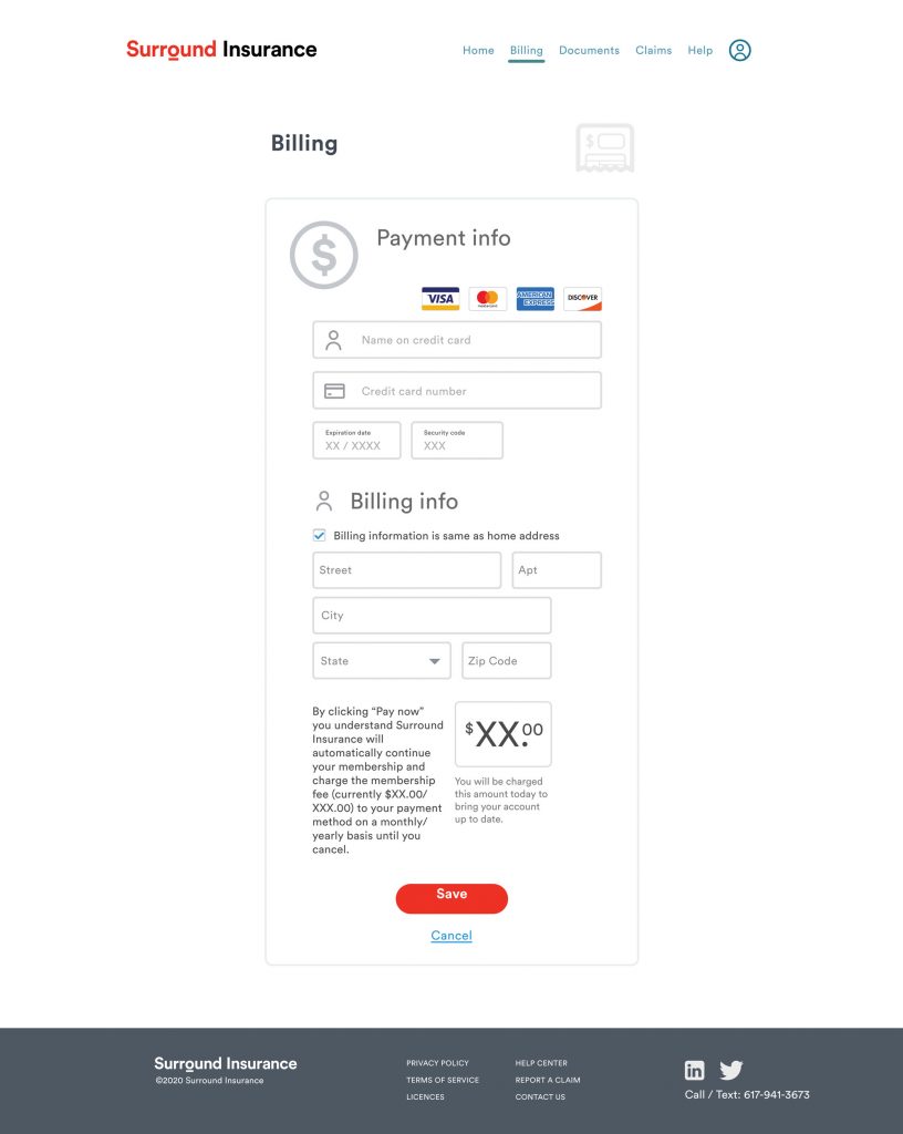
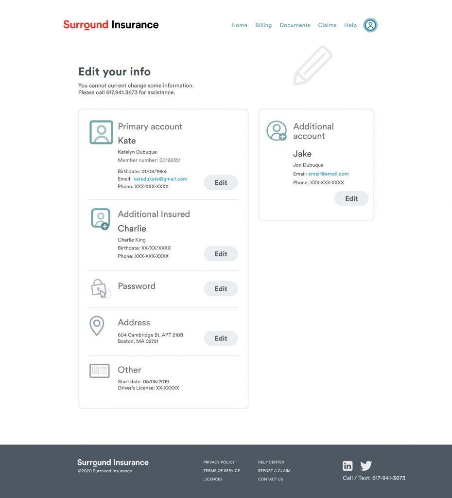
Scope: A member’s portal that they can use quickly, but serves up complex and lengthy insurance documents, along with letting them update some of their information and payment instrument.
Constraints: Nothing can be hard to find or hidden too deeply in the portal. Header nav and homepage should support multiple types of navigation to the same information.
Next steps
The most popular parts of this experience is the transparent pricing page that allows users to customize their pack (our word for bundle). The next most popular section was the details pages that explained each coverage in a pack.
Starting with adding an upsell to strategic member emails to remind them that they don’t have to switch away from Surround when they upgrade their life.