Goal
Future-Proofed the System: Design a library with scalability in mind, making it adaptable for future products, new markets, and evolving brand directions.
Key Contributions:
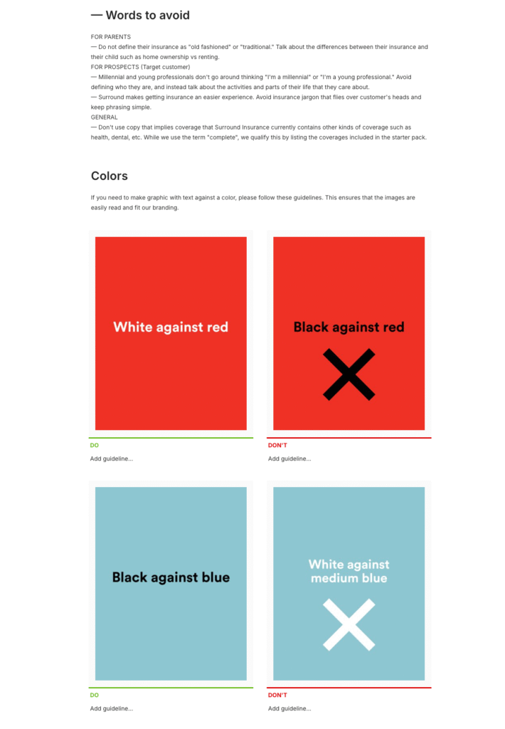
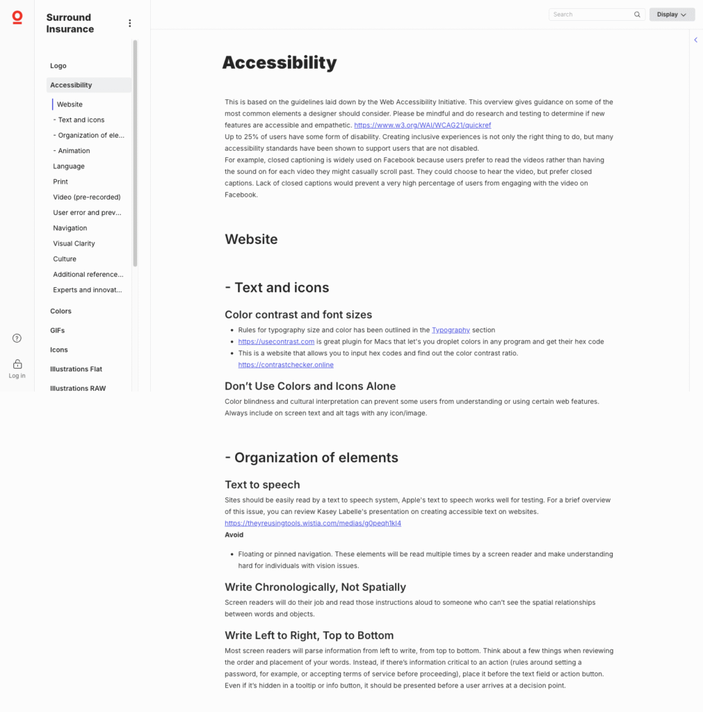
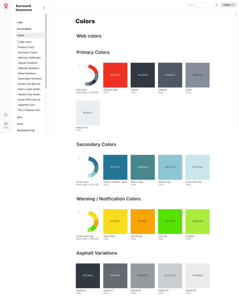
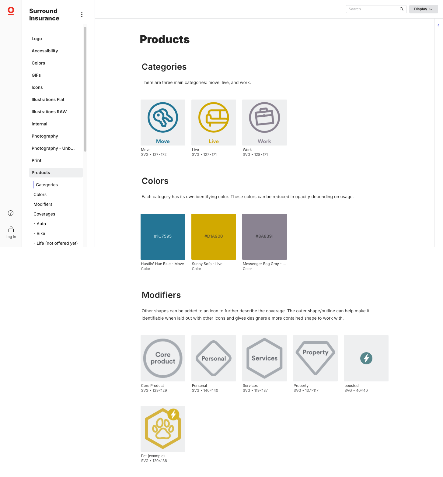
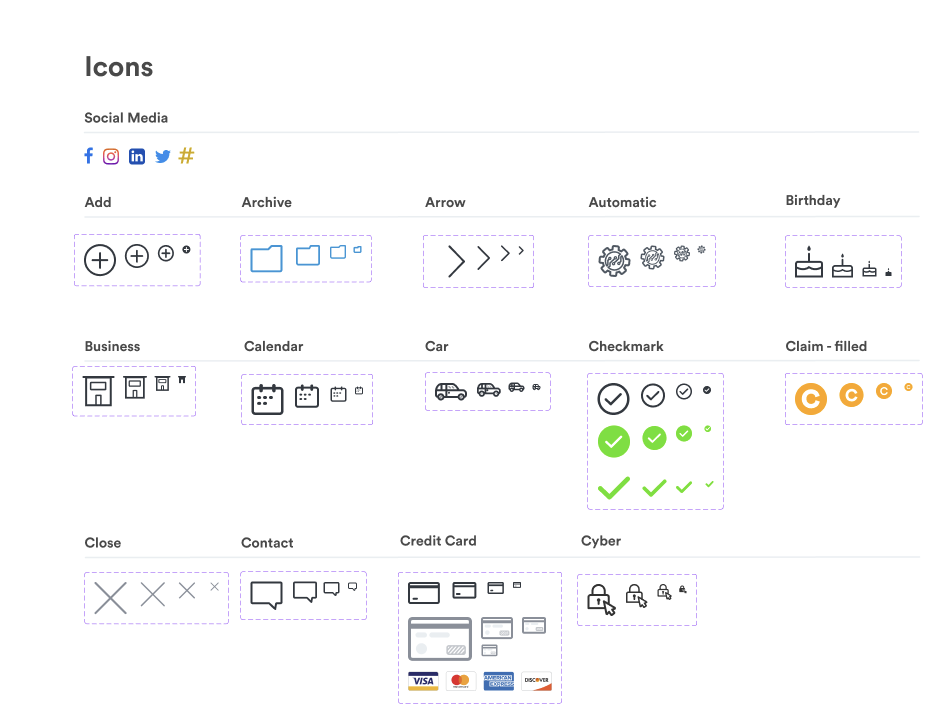
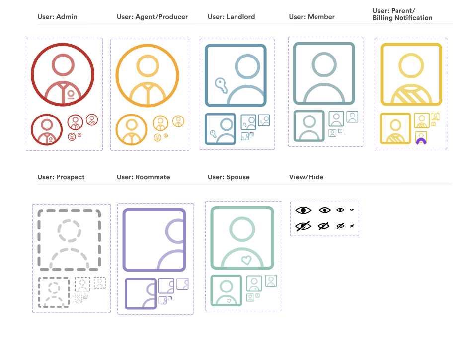
Brand Foundations: Developed a digital design language, including color palettes, typography, iconography, and imagery styles optimized for accessibility and clarity.
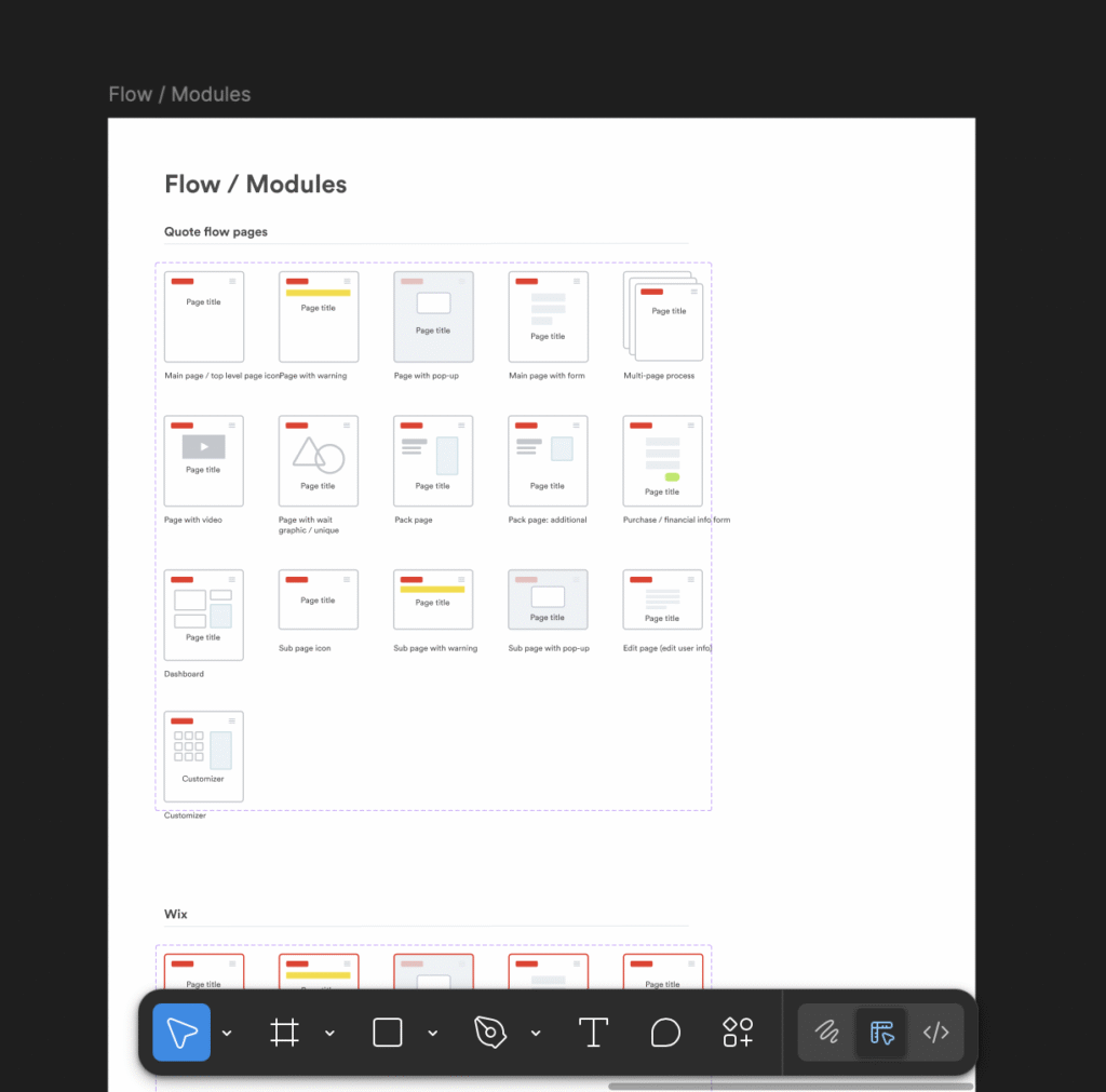
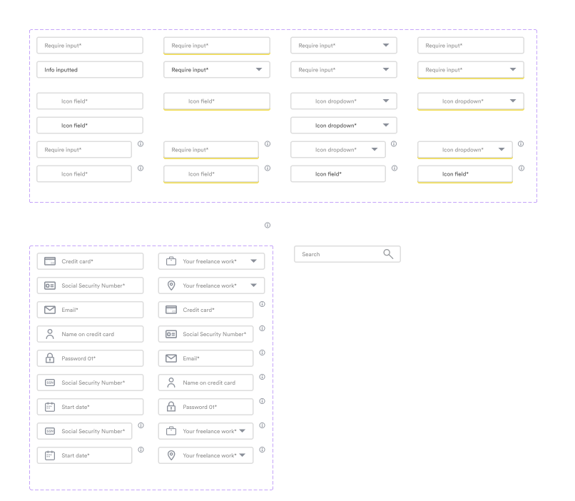
Modular UI Components: Designed and documented reusable interface elements such as buttons, forms, navigation bars, and cards to ensure a consistent look and feel across platforms.
Integrated UX Patterns: Interaction patterns for common user journeys—quoting, policy management, and claims filing—based on user research and best practices.
Streamlined Collaboration: Figma-based library linked to developer handoff tools, reducing design-to-development friction and ensuring accurate implementation.
Combined, there were over 500 assets actively maintained.
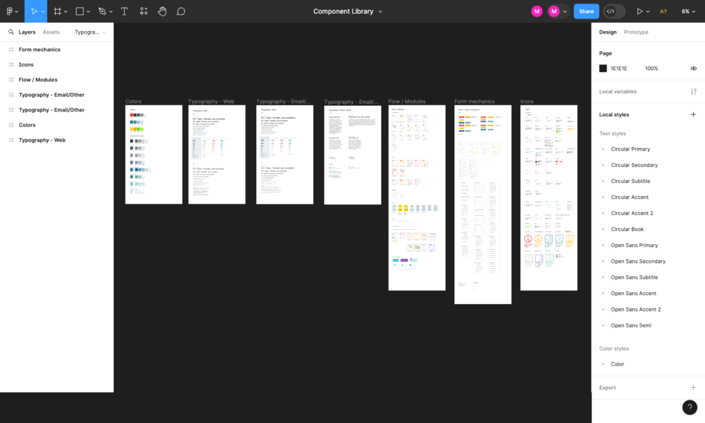
Figma Component Library
Maintaining Figma components for a startup can be surprisingly tricky, because while the tool is designed to streamline design consistency, the realities of a fast-paced, resource-constrained environment can make that consistency hard to preserve.
1. Constantly evolving brand and product direction
In a startup, priorities shift quickly. A color palette, typography style, or layout standard you lock in today might be outdated next month after a new branding pivot, investor request, or feature change. This means components often require frequent updates—and those updates can ripple through dozens of files.
2. Limited design resources
Startups rarely have the luxury of a dedicated design systems manager. The same designer who is building new features is also expected to maintain components, document usage, and resolve inconsistencies. This can lead to rushed updates, missed changes, and “design debt” where the library drifts out of sync with the actual product.
3. Component sprawl and inconsistency
Without strict governance, designers may duplicate components rather than edit the master version—especially when deadlines loom. This leads to multiple slightly different versions of buttons, form fields, or icons, making it harder to enforce a unified look.
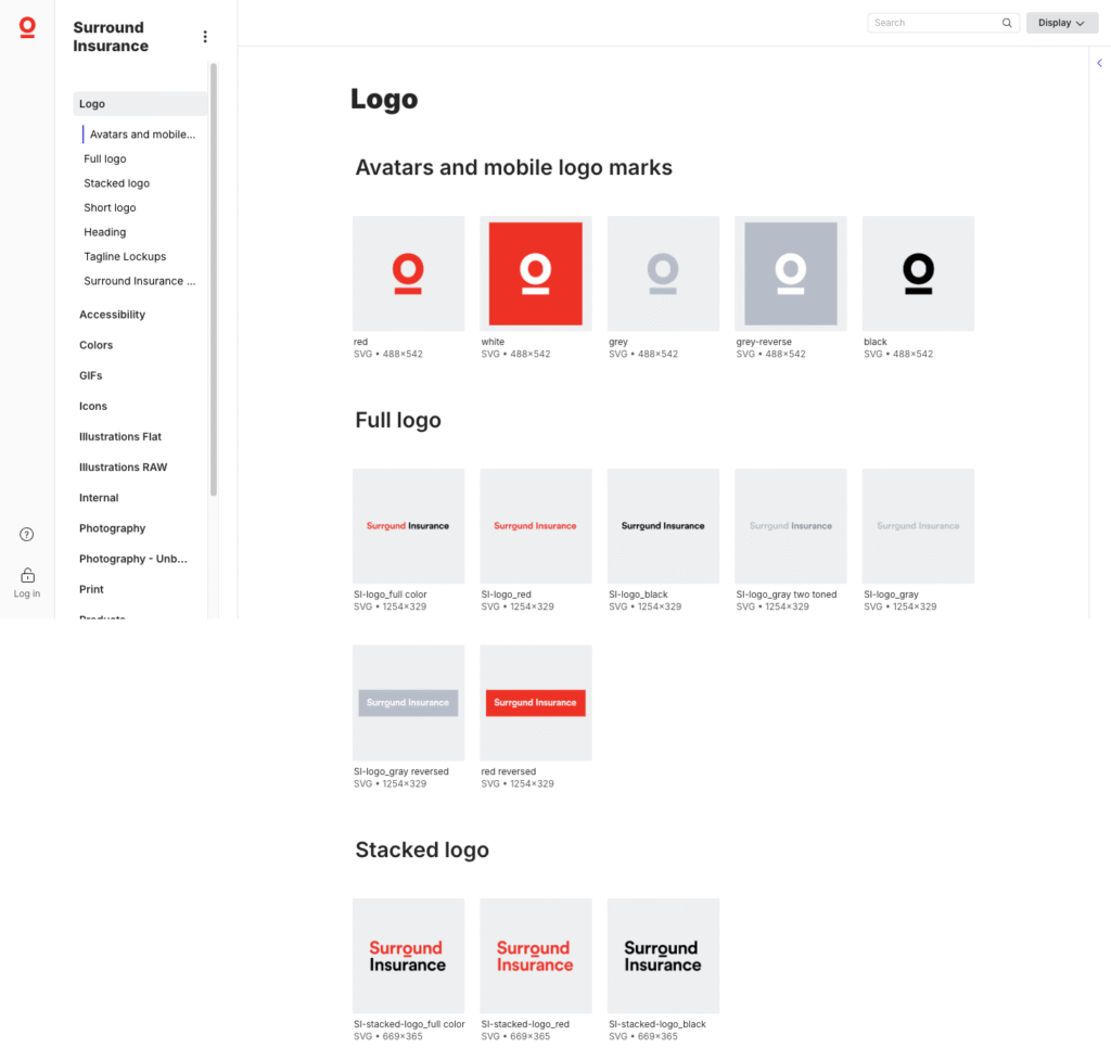
Lingo Brand Library
Lingo is a central hub for brands.
Combining digital brand guidelines and asset management into one easy-to-use and affordable platform is not easy challenge.
Every team member at Surround Insurance needed to be able to find the file they need, in the format and size they need all without needing extra assistance.